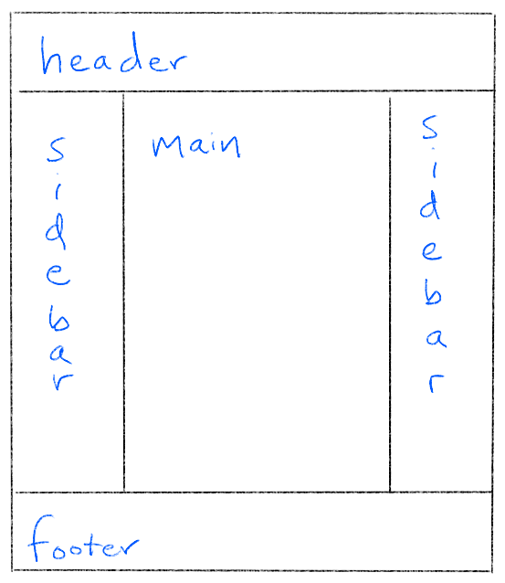
For many years, web developers sought to achieve this holy grail of web interfaces:
The holy grail layout has a header at the top, a footer at the bottom, sidebars on the left and right, and a scalable main content area in the center. This layout was elusive in the early days of the web; thus its name. But Flexbox has eliminated most of these perils.
A flex parent only handles one-dimensional flow. This layout requires control over two dimensions, which you can achieve by nesting a horizontal flex parent inside a vertical one. You might start by making the body element the vertical parent:
You see the header and footer, but where's the middle row? It has no content, so it has no size. You want the middle section to absorb any space that hasn't been taken up by the header and footer. Try setting the middle section's flex-grow property.
By itself, setting flex-grow has no impact. The parent must first have extra space before it can distribute it, and elements don't have extra vertical space unless you take control of their height. Making the body fill the viewport with min-height does the trick:
That takes care of the vertical parent. The middler will serve as the horizontal parent. Its children will be a couple of aside elements for the left and right sidebars and a main element:
The middler's properties show that it is both a flex child and a flex parent. The main section must expand to absorb all the extra space. Try setting its flex-grow property.
After you get main to expand, add some content into the left sidebar. You will see the left sidebar expand and take away real estate from the main element. Probably the sidebars should have a fixed width that isn't influenced by the content. The flex-basis property is your vehicle for assigning this fixed width:
Try adding content to the sidebars now. You will see the content wrap instead of expand the element.
Try adding content to the main element. You will find that the main element expands and takes away space from the sidebars. The problem is that the main elements flex-basis is auto, which means it will puts its baseline size from the element's width value. The width is also set to auto by default, which means the browser will calculate it to fit around the content to the degree possible. You can fix this by setting the basis to 0:
Try adding content to the main element now. You will find the layout to be stable.
As you add content, you are disturbed by how the text runs right up to the edge of its parent elements:
All five cells of the layout need some padding to allow the text to breathe:
That's much better.