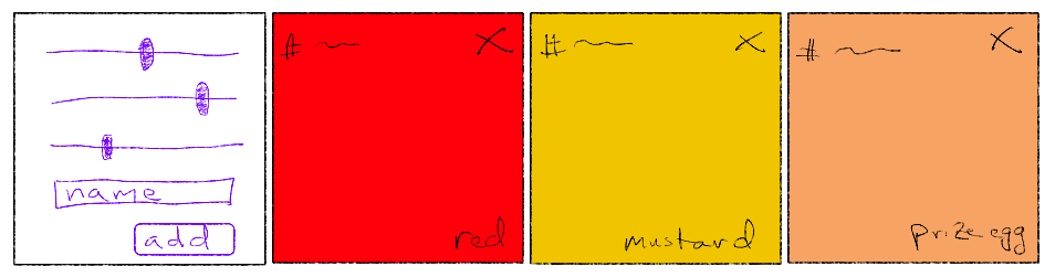
You've sketched out this rough wireframe for your color palette designer:
Each color currently in the palette will be represented by a swatch that shows the color's name, its hexadecimal representation, and a delete button to remove it from the palette.
The user will use the first box to configure new colors and add them to the palette. If you were writing plain HTML, you could create a swatch element on the fly like this:
function createSwatch(name, hex) {
  const swatch = document.createElement('div');
  swatch.classList.add('swatch');

  const nameField = document.createElement('span');
  nameField.classList.add('name-field');
  nameField.appendChild(document.createTextNode(name));
  swatch.appendChild(nameField);

  const hexField = document.createElement('span');
  hexField.classList.add('hex-field');
  hexField.appendChild(document.createTextNode(hex));
  swatch.appendChild(hexField);

  const deleteButton = document.createElement('button');
  deleteButton.classList.add('delete-button');
  deleteButton.appendChild(document.createTextNode('✖'));
  swatch.appendChild(deleteButton);

  return swatch;
}
That's a lot of work to produce what could have been written with these few lines of HTML:
<div class="swatch">
<span class="name-field">NAME</span>
<span class="hex-field">HEX</span>
<button class="delete-button">✖</button>
</div>The designers of React also thought JavaScript was too crude a tool for creating HTML elements. So they built JSX, which stands for JavaScript Syntax Extension. If you have a JSX interpreter processing your JavaScript, you can create a new swatch element like this:
export function Swatch() {
return (
<div className="swatch">
<span className="name-field">NAME</span>
<span className="hex-field">HEX</span>
<button className="delete-button">✖</button>
</div>
);
}A function that creates a reusable element like this is called a component. React developers commonly put each component in its own file. Create a new file in src named Swatch.js and paste in this code.
Note the uppercase S in the filename. React developers view components much like Java developers view classes. Note also the export keyword. This makes the component visible to other files that wish to import it.
The attribute class is renamed className in the JSX to avoid clashing with the JavaScript keyword.
Eventually you will replace NAME and HEX with non-placeholder values. But not yet.
Behind the scenes, the React tooling turns JSX structures embedded in your scripts into calls to the function React.createElement. The Swatch function is translated into something that looks like this normal JavaScript:
export function Swatch() {
  return React.createElement('div', {'class': 'swatch'}, [
    React.createElement('span', {'class': 'name-field'}, 'NAME'),
    React.createElement('span', {'class': 'hex-field'}, 'HEX'),
    React.createElement('button', {'class': 'delete-button'}, '✖'),
  ]);
}
The JSX version is a lot more concise. JSX blends the expressiveness of HTML and the computational power of JavaScript.
With a handy Swatch component in your toolbelt, your next task is to put a swatch into your app. Some crazy magic is about to happen, so you start the live preview if it's not already running. You head to the App component (which is stored in App.js), and nest a Swatch component in its JSX:
function App() {
  return (
    <div className="App">
      <Swatch />
    </div>
  );
}
You could also have written the element with separate opening and closing tags: <Swatch></Swatch>. Since the element has no child elements, you favor the shorter self-closing form.
The preview breaks, and you see an error message about Swatch not being defined. You fix the error by adding an import statement at the top of the file:
import {Swatch} from './Swatch';The ./ means that the file from which you are importing is located in the same directory as the current component. The extension .js is intentionally omitted. Some developers use other languages, like TypeScript, to design components. TypeScript files use the extension .ts. Leaving off the extension in import statements gives you some freedom to use multiple languages within a project and not worry about which language was used to implement a particular component.
The {Swatch} clause is an object destructuring. All of the exported structures from a file are packed into an object of this form:
{
  ComponentA: function() { ... },
  ComponentB: function() { ... },
  helperFunctionC: function() { ... },
  constantD: value,
}
The destructuring unpacks just the structures of this object that you wish to import. In the case of Swatch.js, the only exported structure is the component. The destructuring feels a bit silly if you don't understand its versatility.
The preview is no longer broken. All the content is jammed together, however. You open up App.css and add some styling. You fix the swatch's size, give it some default colors, and set it up to be an anchor for positioning its children:
.App {
  display: flex;
  flex-direction: row;
  flex-wrap: wrap;
}

.swatch {
  display: inline-block;
  width: 200px;
  height: 200px;
  margin: 10px;
  border-radius: 10px;
  box-sizing: border-box;

  color: white;
  text-shadow: 0 0 3px black;
  background-color: black;

  position: relative;
}
You want the name field to be on the bottom right of the swatch, so you add this ruleset:
.swatch > .name-field {
  font-weight: bold;
  font-size: 1.2em;

  position: absolute;
  right: 10px;
  bottom: 10px;
}
The delete button goes on the top right. Since it's a button, you must strip off the default background color and border to make it not look like a standard button:
.swatch > .delete-button {
  border: none;

  background: none;
  color: red;
  text-shadow: 0 0 3px black;
  font-size: 1.5em;

  position: absolute;
  right: 10px;
  top: 10px;

  cursor: pointer;
}
You also add some interactivity on hover and click events:
.swatch > .delete-button:hover {
  transform: scale(1.2);
}

.swatch > .delete-button:active {
  transform: rotate(15deg) scale(1.2);
}
The hex field goes on the top left:
.swatch > .hex-field {
  position: absolute;
  left: 10px;
  top: 10px;
}
As a React project grows in size, you might wish to define a component's styles in its own CSS file. In this case, you would put the swatch styles in Swatch.css and import the CSS in Swatch.js much as App.js imports App.css.
Importing a stylesheet in a script probably seems strange, especially given that the stylesheet is never referenced anywhere in the script. If you don't import the stylesheet, then the React tooling will not bundle the stylesheet into the app it builds for you.